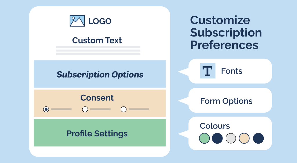
If your organization hasn’t bothered with unsubscribe page branding, you’re missing an opportunity. You’re not alone; for most organizations, the unsubscribe page is an afterthought at best. Think about it. Have you ever noticed that all email unsubscribe pages look the same? In fact, many look like basic, generic pages that were built for the web of 1995!
This is because marketers don’t care about the unsubscribe page. Once a contact has clicked that link at the bottom of the email, they are never going to be a lead or a potential customer. They will never generate revenue. And since marketers don’t care what happens to a lead once it is lost, email marketing software doesn’t care about unsubscribe page branding.
If you are a communicator, then you see things differently. Perhaps you are looking for a better way to communicate with your contacts, not just another way to sell to them. Consider a free, 30-day trial of Envoke. Our email marketing platform is purpose-built for communicators. We understand your unique needs and have made it our mission to build a product that is tailored to help you build relationships, manage large subscription lists, and securely communicate with your stakeholders. Give us a try!
Try Envoke today: Create a free trial account.
Email for communication, not lead generation.
- Includes ALL Envoke features.
- No credit card needed for trial.
- Free, unlimited support.
- Free coaching call with tech support (not sales).
Strengthen Your Reputation
Communications professionals, on the other hand, understand that every touchpoint between their organization and its audience impacts perception and trust. By adopting a consistent communication style, and delivering a consistent experience, you reinforce your credibility and strengthen your reputation. This is why it’s crucial to have complete control over all content your contacts encounter. That includes proper unsubscribe page branding.
In other words, the unsubscribe page is an opportunity. It’s an opportunity to communicate with your contacts. It’s a place to share your breadth of content and let readers know what they have subscribed to, and what they could consider subscribing to. Perhaps you’ve recently refreshed your internal newsletter, or have a great e-blast that will keep them informed. Let them know! The unsubscribe page is also an excellent place to transparently communicate with them about any mandatory content they receive from your organization – information that is not optional and must be delivered for legal or contractual reasons.
Unsubscribe Page Examples Built for Marketers
Mailchimp’s unsubscribe page
This generic-looking page misses an opportunity to display company branding, or indeed share details about the subscription itself. If there is other content this subscriber could consider signing up for, they won’t find it here.
Mailchimp’s email preferences page
Another generic page without unsubscribe page branding, information, or options. This page does nothing to encourage your subscriber to consider other content the organization may offer, nor does it offer any other option beyond “update” or “unsubscribe.” Another missed opportunity.
Cyberimpact’s unsubscribe page
Cyberimpact also fails to offer any unsubscribe page branding in this example. They do take the opportunity to gather some data about why their contact is leaving but don’t display any other information such as other subscriptions the recipient has selected, or other content they may enjoy.
Apollo’s unsubscribe page
Apollo keeps things simple, too simple, in this unsubscribe page without any branding. The only options are to “unsubscribe” or not. Again, a missed opportunity to display other content options or inform their contact about various subscriptions they may be receiving from this organization.
Generic Branding: A Hidden Risk
Many organizations find themselves constrained by the default text and styles offered by their email marketing platforms. This limitation forces their contacts to interact with generic, third-party pages that bear no resemblance to their brand. Such inconsistencies can dilute your organization’s identity harm your image and reputation and make it seem like you don’t care.
Marketing-centric email platforms offer limited customization for elements like email signup forms, and the all-important email preferences page (often referred to as the “unsubscribe page” or “email preference center”). Using default templates with generic text and style creates serious disconnects for your contacts.
Comprehensive Branding Control For Communicators
Envoke understands the importance of brand consistency and delivers a suite of features to ensure every contact interaction aligns with your brand:
- Colour and Font Control: Match colors and fonts exactly to those defined in your brand style guide.
- Customizable Text: Including headlines, button labels, descriptions, and subscription options
- Locked Template Sections: Protect headers, footers, your logo, and other crucial elements from accidental changes in your templates. Sections can be designated for admin-only editing.
- Custom Domain: Increase trust by replacing Envoke’s domain with your public-facing pages, media, and links – raising open rates and reducing unsubscribes.
- Seamless Website Forms: Design forms that integrate flawlessly with your website, both in style and functionality, eliminating jarring transitions to third-party solutions.
- Zero Envoke Branding: Maintain a clean, fully consistent experience with the ability to turn off the Envoke logo in favor of yours, even on standard billing plans.
- Sub-accounts for Distinct Branding: Manage multiple departments with unique branding requirements easily through sub-accounts that function as sub-brands within your larger organization.
Unsubscribe Page Branding: Examples for Communications Professionals
All content and styles, including the domain name, are customizable to ensure the page follows branding guidelines and uses your communications terminology.
Why Envoke: Unprecedented Consistency
The lackluster unsubscribe pages you see out there in the world exist for a reason – but not one your organization needs to accept. These third-party-branded pages clash with your otherwise consistent communications, doing a disservice to your overall reputation.
